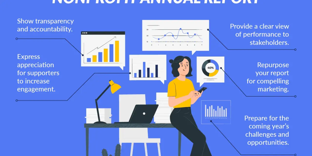
Strong annual reports do more than recap a year. For a nonprofit, they show how resources were used, what changed for the people served, and whether leadership is making disciplined decisions. In practice, a nonprofit annual report is part communications piece, part governance tool, and part trust-building document.
The essential points to get right before you publish
- Start with audience and purpose before you think about design or length.
- Show mission, outcomes, finances, and contributors in one coherent story.
- Keep the public report distinct from the IRS Form 990, but make sure the facts line up.
- Use plain language, selective data, and a few strong visuals instead of trying to say everything.
- Make the board part of the review process, especially for financial, legal, and governance claims.
What the report needs to prove at a glance
The first mistake I see is treating the report like a ceremonial brochure. The better approach is simpler: the document should prove that the organization knows what it did, why it mattered, and how it handled resources. The National Council of Nonprofits recommends starting with two questions that keep the whole project honest: who is the audience, and what do you need the report to accomplish?
That framing matters because different readers want different answers. Donors want reassurance that gifts were used well. Board members want oversight and a clear picture of risk. Foundations want evidence of outcomes and alignment. Community partners want to know whether the organization is credible, stable, and useful. If the report tries to satisfy everyone with one vague message, it usually satisfies no one.
| Audience | What they are trying to learn | What the report should answer |
|---|---|---|
| Individual donors | Trust, impact, and stewardship | Did the organization deliver real results and use funds responsibly? |
| Board members | Oversight and accountability | Are the finances, governance practices, and disclosures in order? |
| Foundations and grantmakers | Strategy and measurable outcomes | Does the work show evidence of progress and room to scale? |
| Community partners | Reliability and relevance | Is this organization stable, transparent, and worth collaborating with? |
Once the audience is clear, the report stops being a generic year-end recap and becomes a strategic communication tool. That makes the next question much easier to answer: what actually belongs inside it?
What belongs in a nonprofit annual report
I usually think in terms of six essentials. If those are strong, the report can be short or long, digital or printed, formal or visual. If they are weak, no amount of design polish will save it.
| Section | Why it matters | What strong content looks like |
|---|---|---|
| Mission and year in review | Sets the context for the year | A concise narrative of what changed, not a history lesson |
| Program outcomes | Shows real-world impact | Measured results, participant stories, and honest limitations |
| Financial snapshot | Builds stewardship and confidence | Revenue, expenses, funding mix, and a plain-English explanation of unusual shifts |
| People and recognition | Signals gratitude and community | Supporters, volunteers, staff, and partners acknowledged without turning the report into a donor roll call |
| Leadership and governance | Reinforces credibility | Board oversight, key policies, and any major governance improvements |
| What comes next | Prepares readers for the future | Clear priorities, not vague optimism |
The strongest reports also balance emotion and evidence. Photos matter. Short quotes matter. So do numbers. I want to see both the human outcome and the operational proof that supports it. A year-end report that only talks about feeling leaves readers guessing; one that only lists metrics can feel cold and interchangeable.
That balance is also where many organizations quietly improve donor confidence. When the report acknowledges challenges, shows what was learned, and explains how the team responded, it feels credible. That is much stronger than an overly polished piece that pretends every quarter went perfectly. With the content set, the real challenge is building it in a way that stays accurate and readable.
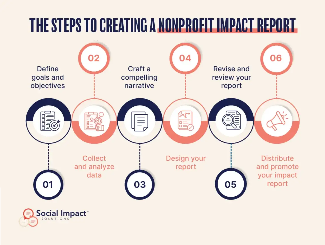
How to build the report without turning it into a burden
The easiest way to make this work is to treat it like a short production process, not a one-off writing assignment. I would run it in six steps:
- Choose one primary message. For example, growth, resilience, recovery, expansion, or deeper community reach.
- Collect proof points early. Pull program results, financial figures, donor counts, volunteer hours, and any major milestones before drafting.
- Write the story before the layout. Design should support the message, not force it.
- Use plain language. If a sentence sounds like internal jargon, simplify it.
- Verify every number and name. This is not the place for fuzzy estimates unless they are clearly labeled as estimates.
- Review the document as a reader would. Ask whether a donor, board member, or foundation officer would understand the point in one pass.
I also recommend keeping one person accountable for final consistency. Too many reports become patchworks because finance, development, programs, and communications all write separate sections without a single editorial owner. The result is usually a document with conflicting numbers, repetitive claims, or a tone that changes every page.
If the report includes a story about impact, I want the story and the metric to support each other. A good formula is simple: claim, evidence, implication. For example, if the organization expanded access to services, the report should explain by how much, for whom, and what changed operationally to make that possible. Once that process is clear, it becomes much easier to separate the storytelling layer from the legal disclosure layer.
The governance and disclosure details that should not be fuzzy
This is where many nonprofit leaders get overly casual, and I think that creates unnecessary risk. The public-facing report is not the same thing as the IRS Form 990. One is a strategic narrative; the other is a public compliance document. They should agree on the facts, but they do not serve the same purpose.
| Document | Main purpose | Primary audience | Practical risk if it is weak |
|---|---|---|---|
| Annual report | Tell the year’s story and build trust | Donors, partners, community members, staff | Readers lose confidence or misunderstand the organization’s work |
| IRS Form 990 | Public tax and governance disclosure | IRS, regulators, journalists, funders, the public | Inaccurate or incomplete public disclosures create legal and reputational exposure |
U.S. tax-exempt nonprofits generally must provide, upon request, copies of the three most recently filed annual information returns and the tax-exemption application, including related IRS correspondence. Many organizations also make those documents easy to find on their websites because transparency is easier when the information is already accessible. I see that as a practical trust move, not just a compliance gesture.
The board also has a real role here. Board members should review the Form 990 before it is filed, and they should understand how the document presents the organization’s finances, governance practices, and activities. That review is not busywork. It is part of fiduciary oversight. If the board is not engaged in that process, the annual report will not fix the credibility gap.
Governance details like conflicts of interest, whistleblower procedures, and executive compensation do not belong in every narrative paragraph, but they do shape how readers interpret the organization’s seriousness. If your report celebrates transparency while the underlying governance is weak, the inconsistency will show. After that, format decisions matter because they control how widely the report gets read.
Choosing the format that fits how people actually read
There is no rule that says a report must be a glossy booklet. In fact, a digital-first format is often the smarter choice in 2026, especially if your audience is broad and your team needs something easier to update, share, and measure. Still, print has a place when a tangible piece supports major donor cultivation, event distribution, or direct board use.
| Format | Best use case | Main strength | Main limitation |
|---|---|---|---|
| Emailing to donors, board packets, archiving | Simple to produce and easy to download | Can feel static and hard to read on mobile if designed poorly | |
| Web page or microsite | Broad public sharing and search visibility | Mobile-friendly and easy to update | Requires maintenance and stronger editorial discipline |
| Printed booklet | Events, major donors, local partners | Physical and memorable | Printing and mailing costs can add up fast |
| Infographic | Quick scanning and social sharing | High-impact visuals, fast comprehension | Limited room for nuance |
| Video | Story-driven campaigns and fundraising moments | Human and emotionally vivid | More production effort and accessibility requirements |
The point is not to chase novelty. The point is to match the format to the behavior of the reader. If most stakeholders will encounter the report on a phone, then mobile readability, contrast, captions, and short sections matter more than heavy visual effects. If a donor is likely to keep a printed piece on a desk, a shorter physical version may do more work than a large digital report no one opens twice.
I also would not assume digital automatically saves time or money. A website or interactive report can be efficient once the workflow is established, but it can also consume more internal hours if the team has to learn a new tool, revise assets repeatedly, or retrofit accessibility at the end. The best format is the one your organization can sustain without sacrificing accuracy. Even the best format fails if the draft itself is cluttered or inconsistent.
The mistakes that quietly weaken trust
The reports that underperform usually fail in predictable ways. None of these problems are dramatic on their own, which is why they survive so often.
- Too much praise, too little evidence. Fix it by pairing every major claim with a number, example, or outcome.
- Financials that are buried or vague. Fix it by showing revenue, expenses, and any unusual changes in plain English.
- Generic language that could describe any nonprofit. Fix it by using specific programs, communities, and results.
- No honest account of setbacks. Fix it by naming one or two challenges and what the organization learned from them.
- Inconsistent numbers across sections. Fix it by reconciling every figure with finance before publication.
- Design that makes the report hard to skim. Fix it by shortening paragraphs, using clear headings, and making key facts easy to spot.
- Governance left out entirely. Fix it by including board oversight, policy discipline, and disclosure practices where appropriate.
One rule I rely on is this: if a statement sounds impressive but cannot be defended, it belongs in the rewrite pile. Donors and board members are usually more sophisticated than organizations assume. They notice when impact is described in broad, celebratory language but not connected to operations or financial reality.
Another common problem is trying to make the report sound bigger than the organization actually is. That creates friction. A small nonprofit with clean data, a clear mission, and a credible explanation of progress often looks stronger than a larger organization that hides behind decoration. That brings us to the final check I would run before anything goes public.
The version I would approve before it goes live
Before I publish a report, I want five things to be true. First, the message is clear in one sentence. Second, the financials match the latest internal statements and the public filing. Third, the outcomes are specific enough that a reader can tell what changed. Fourth, the board has reviewed the sections that touch governance or disclosure. Fifth, the report reads well on both desktop and mobile.
- The opening explains the year, not the organization’s entire history.
- The financial section is understandable without a finance background.
- The impact section shows both results and limits.
- The report includes a forward-looking note with realistic priorities.
- The design helps the reader move, not just admire the layout.
When those pieces are in place, the report does more than recap a year. It shows that the organization knows what it did, what it learned, and where it is headed next. That is the real job of the document, and it is what turns a routine annual publication into a credible asset for governance, strategy, and fundraising.