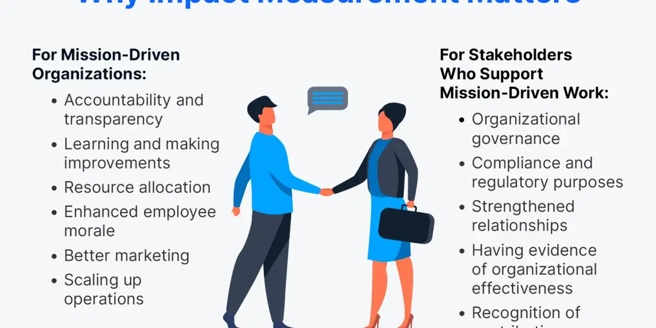
Nonprofit impact measurement works best when it is treated as an operating system, not a reporting exercise. The real job is to show whether services are changing lives, which outcomes matter most, and where leaders should adjust programs, budgets, and staffing. In practice, that means connecting mission, theory of change, data collection, and board-level decisions in one coherent process.
What matters most before you build a measurement system
- Start with the change you want to see, then map the activities that should create it.
- Track a few meaningful indicators per program instead of a long list of easy-to-count outputs.
- Use mixed methods so quantitative data is explained by qualitative evidence, not left floating alone.
- Be honest about attribution, because in most nonprofit work contribution matters more than perfect proof.
- Turn data into a regular management habit so the numbers change decisions, not just reports.
Start with the change you want to prove
I always begin with the outcome, not the spreadsheet. If an organization cannot describe the change it wants to create in plain language, no amount of data collection will make the measurement system useful. That is why a theory of change and a logic model matter so much: they force the team to explain how inputs become activities, how activities produce outputs, and how outputs are supposed to lead to outcomes.
That sequence is not academic decoration. It is the backbone of disciplined strategy. Bridgespan recommends the same basic flow: define the outcomes that matter, measure them with quantitative and qualitative data, then learn and improve. I think that is the right order because it keeps measurement tied to decisions instead of vanity metrics.
When I help teams clarify their measurement goals, I ask four questions:
- What exactly should change for the people or communities we serve?
- What needs to happen first for that change to be realistic?
- Which assumptions are we making that could easily be wrong?
- What decision will this measurement help us make this quarter or this year?
If you can answer those questions, you have the outline of a serious measurement plan. If you cannot, the organization is probably measuring activity before it has agreed on meaning. Once the change pathway is clear, the next step is choosing indicators that reflect that change instead of merely recording motion.
Choose indicators that reflect outcomes, not just activity
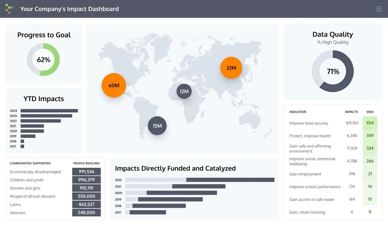
This is where many nonprofits drift off course. They track what is easiest to count, then mistake volume for value. A better approach is to separate outputs, outcomes, and long-term impact so each metric has a job to do. I usually recommend a small dashboard, often no more than 3 to 7 core outcome indicators per program, because leaders can only act on a limited amount of information at once.
A simple way to think about it is this: outputs tell you what you delivered, outcomes tell you what changed, and impact tells you what lasting difference the organization contributed to over time. The distinction matters because a nonprofit can increase service volume without improving results, and it can improve results without serving more people. Both are real possibilities, and both should be visible.
| Measure type | What it tells you | Example | Common trap |
|---|---|---|---|
| Output | How much work happened | 200 families attended a housing workshop | Counting activity as success |
| Outcome | What changed for participants | Families secured stable housing within 90 days | Using a result without baseline context |
| Impact | Long-term difference tied to the mission | Fewer households experience repeated homelessness | Claiming more causality than the data supports |
| Equity check | Who benefits and who does not | Outcomes by race, ZIP code, age, or income band | Average results hiding unequal results |
For a youth education nonprofit, that might mean tracking attendance, grade progression, and graduation readiness rather than just the number of tutoring sessions delivered. For a food security organization, it might mean tracking repeat food insecurity, not only pantry visits. For a legal aid group, it might mean case resolution, housing stability, or wage recovery. The metric should match the decision the nonprofit wants to make, not the easiest thing to count.
Urban Institute’s Measure4Change playbook makes a useful point here: logic models and theories of change are foundations for shared language and program improvement, not merely visuals for grant applications. I agree. If the metric cannot change a staffing choice, a budget line, or a program design decision, it is probably not worth keeping on the dashboard. The next challenge is collecting the data without making the work harder than it needs to be.
Collect data without burning out your team
Good measurement is disciplined, but it should never feel like a second full-time job. The smartest nonprofit teams use a blend of administrative data, short surveys, interviews, focus groups, and observation. Each method gives a different kind of evidence, and together they are much more useful than a single number pulled from one source.
Here is the practical rule I use: collect the lightest data that can still support the decision you need to make. If a dashboard only needs monthly service counts, do not build a quarterly research project around it. If you need to understand why a program is failing to move outcomes, then you need richer feedback from clients, staff, or partners.
- Administrative data works well for volume, timing, attendance, case status, and service completion.
- Short surveys work well for knowledge, confidence, satisfaction, perceived safety, or self-reported behavior change.
- Interviews and focus groups work well when you need to understand barriers, unintended effects, or uneven results.
- Observation and case notes work well when the change is subtle, relational, or highly contextual.
I also like to separate cadence by purpose. Operational metrics can be reviewed monthly. Outcome indicators usually make more sense quarterly, because they need time to move. Deeper learning studies, especially anything that depends on interviews or longitudinal follow-up, can be annual or tied to a specific program milestone. That rhythm keeps the team from drowning in reporting while still creating enough signal to learn from.
One more practical point: if you are asking clients for feedback, respect their time. Ten-minute surveys are usually far more realistic than long forms, especially in programs that serve people under stress. The more burden you place on respondents, the more likely it is that your sample becomes biased toward the people with the most time and patience. Once the data is collected well, the harder question appears: how do you show what actually changed, and how confident can you be about why it changed?
Show what changed and why it changed
This is the part of measurement that most boards and funders care about, and it is also where organizations tend to overclaim. In the nonprofit world, proving perfect attribution is rarely realistic. People are influenced by family, housing, policy, health, school, employers, and dozens of other factors. That is why I usually push teams toward strong contribution evidence instead of impossible certainty.
The right method depends on the question. If you just need a first pass at improvement, a pre/post comparison may be enough. If you need stronger evidence, a comparison group or cohort tracking helps. If you need to understand implementation quality, interviews and case reviews may be more valuable than a statistical model. And if you want a dollar-based view of social value, Social Return on Investment can be useful, but only if the assumptions are transparent and conservative.
| Method | Best when | What it gives you | Limitation |
|---|---|---|---|
| Pre/post measurement | You want a simple view of change over time | Before-and-after movement on a metric | Hard to separate program effects from outside influences |
| Comparison group | You need stronger evidence of contribution | A rough counterfactual for what might have happened otherwise | Can be expensive or impractical to set up |
| Cohort tracking | Results unfold over months or years | How the same group changes over time | Drop-off in follow-up can weaken the signal |
| Qualitative follow-up | You need to understand the “why” behind the numbers | Context, stories, barriers, and unintended effects | Does not give a clean percentage on its own |
| SROI | Stakeholders want a monetary framing | A translated estimate of social value | Can create false precision if assumptions are weak |
The best measurement systems usually mix these methods rather than worshipping one of them. That is especially true for nonprofit operations, where the goal is not just to prove a case to outsiders. It is to help leaders see whether the program is actually working, whether the target group is responding as expected, and whether the organization should keep, stop, or redesign an initiative. Once the evidence exists, it needs to reach the people who can act on it.
Build a reporting rhythm that leaders actually use
Measurement becomes useful only when it changes behavior. For U.S. nonprofits, that means the board, executive team, program managers, and funders all need different versions of the same truth. A board should not receive a dump of raw data. It should receive a compact view of mission performance, risks, trends, and decisions needed. Program teams, by contrast, need enough detail to adjust delivery quickly.
I think of reporting as a governance tool as much as a management tool. If the board only sees financial statements, the organization has governance without full mission oversight. If staff only see monthly counts, they may manage volume while missing whether those counts are translating into results. The right cadence keeps both sides aligned.
| Audience | What they need | Typical cadence | Best use |
|---|---|---|---|
| Board | Mission progress, major risks, resource tradeoffs | Quarterly | Governance and strategic oversight |
| Executive team | Trends across programs, budget implications, staff capacity | Monthly or quarterly | Planning and prioritization |
| Program managers | Operational data, participant feedback, implementation issues | Weekly or monthly | Real-time program adjustment |
| Funders | Progress against grant goals and evidence of contribution | According to grant cycle | Accountability and renewal decisions |
In practice, I like a simple structure: one page for headline metrics, one page for interpretation, and one page for decisions or actions. Anything longer should be reserved for deeper analysis, not routine reporting. That keeps the organization focused on what the data means, not just on generating pages. The next section covers the mistakes that quietly break that discipline.
Avoid the mistakes that quietly distort the story
Most weak measurement systems fail for predictable reasons. The data is not necessarily fake, but it is incomplete, unbalanced, or disconnected from decision-making. I see the same mistakes again and again, especially in organizations that are underfunded or growing quickly.
- Measuring activity instead of change, which makes the organization look busy without proving value.
- Tracking too many indicators, which spreads attention thin and makes analysis harder.
- Collecting data without a baseline, which makes it difficult to say whether anything improved.
- Ignoring negative or uneven results, which hides where the program is not working well.
- Leaving clients and staff out of the process, which often leads to metrics that miss what matters.
- Reporting numbers that no one uses, which turns measurement into administrative theater.
The easiest fix is also the most uncomfortable one: remove metrics that do not inform a decision. If a measure will not change staffing, design, funding, or strategy, I would question why it is in the dashboard at all. That discipline is what turns measurement into a management system rather than a reporting habit. It also sets up the final question, which is what good measurement looks like after a team has been doing it long enough to learn from it.
What strong measurement looks like after the first year
After the first year, a healthy measurement system usually becomes quieter and more useful. The team has stopped obsessing over every data point and started paying attention to patterns. The board knows what it is looking at. Program leaders know which numbers matter. And funders hear a story that is backed by evidence instead of polished language alone.
If I were advising a nonprofit today, I would aim for these signs of maturity:
- One clear theory of change for each major program or program cluster.
- A short list of outcome indicators that everyone can explain the same way.
- Regular review meetings where data leads to concrete actions.
- Qualitative feedback that is used to interpret the numbers, not just decorate them.
- Honest reporting about limits, tradeoffs, and what the organization still does not know.
That is the real value of the work. Good measurement helps a nonprofit learn faster, spend more wisely, and protect mission focus when pressure builds. If you start with the change you want to create, choose a small set of meaningful indicators, and build a reporting rhythm that leaders actually use, the organization gets something far more valuable than a nicer dashboard. It gets better decisions.